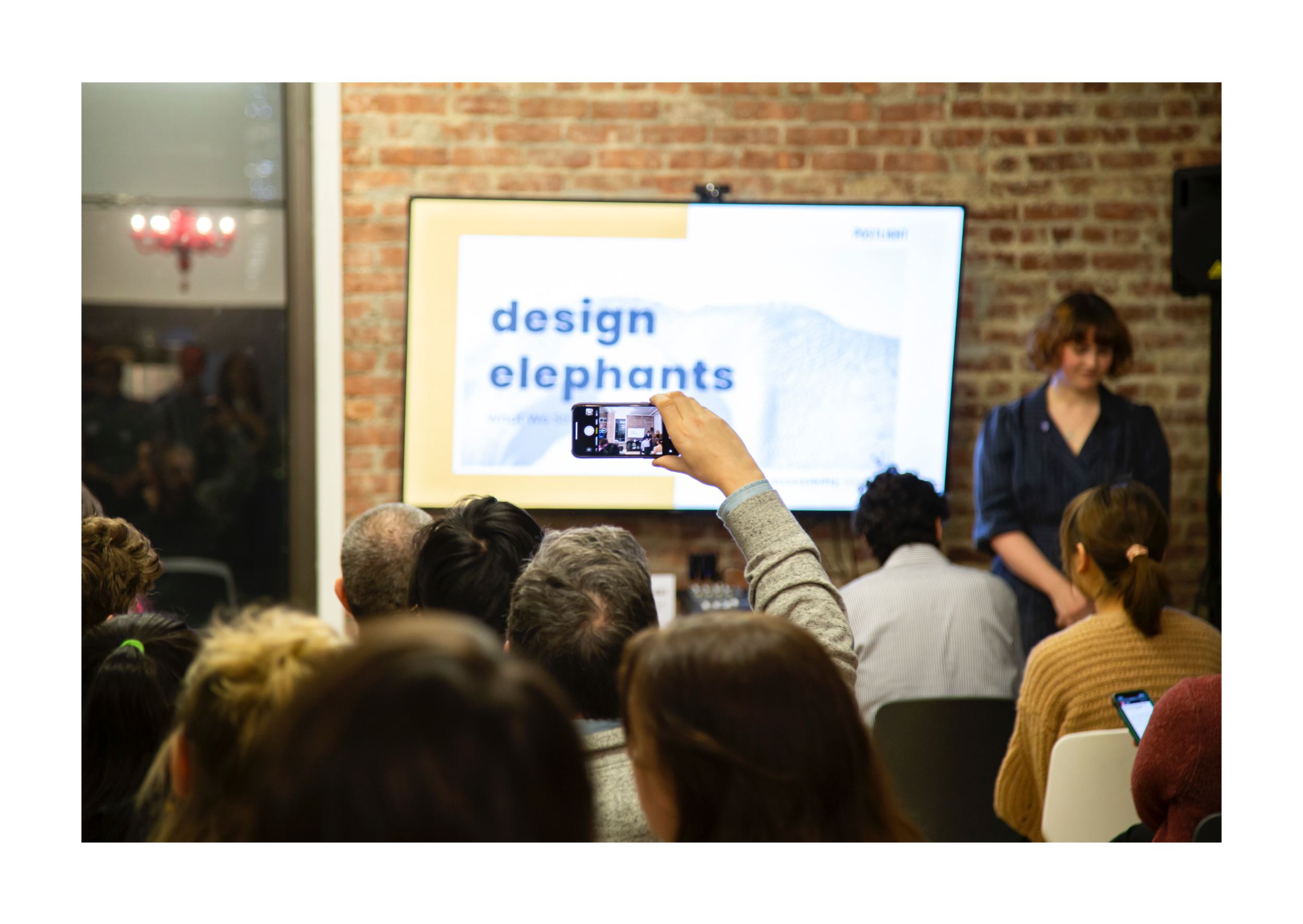
A quarterly event focused on problematic areas in design
MY ROLE CREATOR | CO-PRODUCER | EVENT BRANDING
Event Brief
As digital designers, we are constantly striving to stay ahead of an ever-changing industry. However, there still exist pockets where we have not gained as much ground as we should have due to a lack of discourse or willful ignorance. Design Elephants is a quarterly event that I conceptualized to create a safe space to not only identify some of these problematic areas that we as a discipline still shy away from and seek to facilitate discussion around them.
Event Details
Working directly with the Postlight design team, we identified four key topics we wanted to bring to center the event discussion around: accessibility, design ego, ageism and screen time. Our first event was centered around the topic of accessibility and the complicated relationship digital designers have with creating systems that are truly inclusive for everyone. As personal technology grows more and more, it is imperative that the designers who are helping to build out these experiences are helping to define them for all.


Speakers
To help lead the discussion, we decided to bring in outside speakers who could be considered subject matter experts in this area: Regine Gilbert, the author of “Inclusive Design in the Digital Age: Designing with Accessibility in Mind”, and Walei Sabry, City Digital Accessibility Coordinator for the New York City Mayor’s Office.
For each event, designers from the team volunteered to co-produce the event with me to be able to work in the topic that interested them the most, but also to give them hands-on experience as to what it all takes to effectively execute a design event. For this event, I got to partner with Senior Product Designer Nora Vanni, who had recently written the article “Making the Case for Accountablity,” and shared tips on how to best advocate for accessibility in the design process.


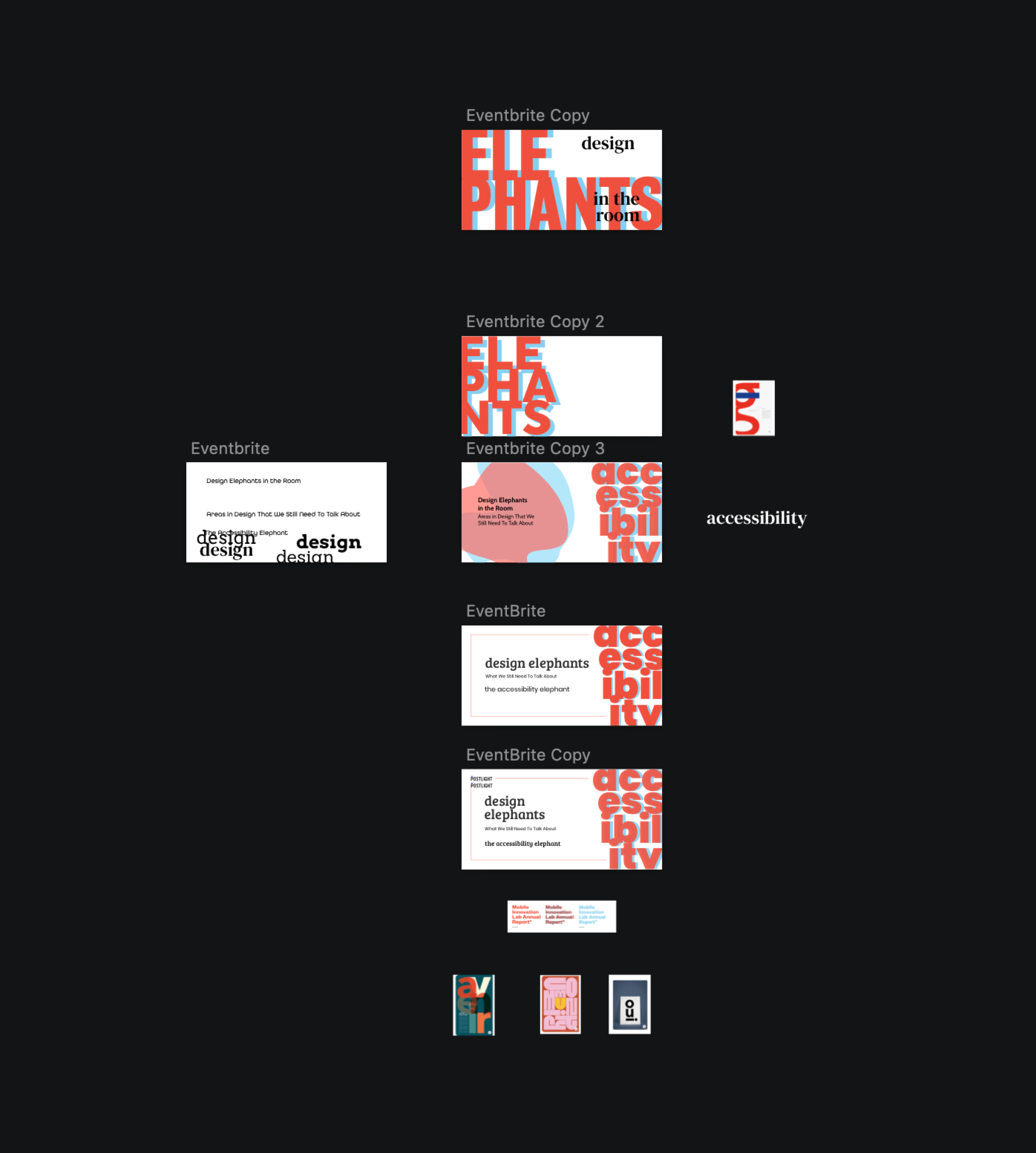
Branding
For the branding, my main goal was not to create a visual that was too “on the nose.” original concept of the series was “Four Letter Words..”, a nod to the humorous way random words sometimes become profane due to an individual’s perception of them (e.g. golf, work, etc.) However, after continuously trying to define the concept, iterating on visual takes, it became apparent that the concept of four-letter words was not landing the way that I was hoping or intending.
So I went back to the proverbial drawing board.
It was when I was reading an article in AdWeek by Doug Zanger that I connected to a new concept. In his article, “Why This TBWA Creative Leader Wants to See More Focus on Older Industry Pros,” Zanger coined the phrase the ageism elephant that resonated with me as to how I needed to approach framing this. The idiom “elephant in the room,” is defined as being something obvious that everyone is willfully ignoring so as not to feel uncomfortable. Playing with this, I landed on “Design Elephants,” dropping the “in the room” to tighten it up..

Direction One
For the visuals, I had carte blanche due to the fact that I was spearheading the event. Again, my initial m.o. was that I wanted absolutely no elephants in the brand. I felt like it was too obvious and cliche for the tone of event I was driving for. I began with doing iterations with type treatments, playing with size to evoke “elephant,” and juxtaposing that against the edges of the artboard to evoke it being “too large for the room/container.” I also played with a retro 3-D color application, for no other reason than I liked it and wanted to play with it. I also played with a variety of fonts and font combinations to get a sense of what felt like it would work. Ultimately, I abandoned this direction because of a variety of reasons, but the main reasoning being the lack of legibility was problematic, especially as the topic of the event was accessibility.
Direction Two
For my second direction, I decided to lean into what I didn’t want: elephant imagery. I scoured the internet for free stock imagery of elephants to incorporate into the design. Here I wanted to lean back into legibility and decided to move forward with the Google font Poppin which I had discovered in the previous explorations. With this direction, I was playing with trying to keep things minimal, more subdued use of color, as well as layout and image perspective. What I felt was lacking from these explorations was a level of high design I was striving for. The design felt unresolved, mundane, and dull.

Final Direction
For this direction, I knew that I wanted to keep the use of Poppin and I still was interested in the idea of elephant imagery and making it more abstract. I went back to researching design visuals and looked at editorial design styles to draw inspiration from. What resonated with me was the use of color blocking and lines in creating the layout, and abstracting the elephant image further.
I also went back to looking for additional elephant images and found one where I could abstract the shape of the elephant into a just a curve, hinting, and the animal but not focusing on it, allowing all the components of the design: color, line, shape, type, layout, etc to come together for the final brand imagery.

